
Performance/Risk/Attribution Dashboards
Performance and Total Return
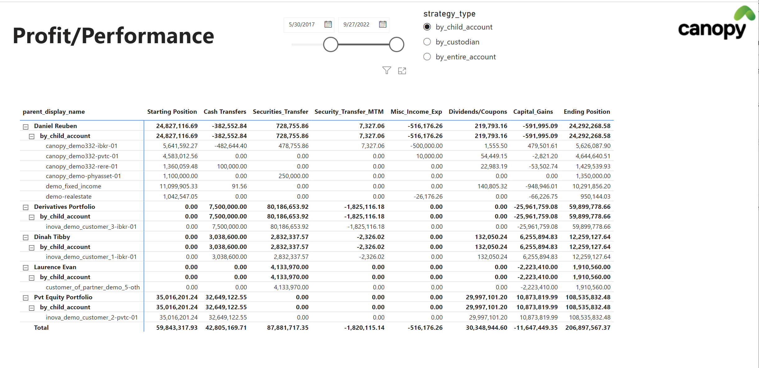
P&L Breakdown
This dashboard breaks down the change in position or networth to it's components. It works as follows
- User selects any date range from the calendar slider
- They also choose any grouping they want (we call it strategy_type)
- The dashboard works from left to right
- first column is the starting position
- intermediate columns explain all the various things (like Security Transfers and Capital Gains etc.) that would have an impact on the closing position
- Starting Position + all the various components = Closing Position
An interactive version of this dashboard below can be seen here
Time Weighted Returns (TWR)
The time-weighted return (TWR) multiplies the returns for each sub-period or holding-period, which links them together showing how the returns are compounded over time.
The time-weighted return (TWR) helps eliminate the distorting effects on growth rates created by inflows and outflows of money.
Time Weighted Returns are calculated in the following methods
- TWR on Networth (i.e. Leveraged Returns)
- TWR on Non Cash Assets (i.e. ignores the funding cost of the strategy)
- TWR on Cash Deployed
- Unleveraged TWR
Interactive version of the dashboard below can be seen here
.png")
Dashboards can show TWR on any of the infinitely configurable calculations done on your account
Internal Rate of Return (IRR)
IRR, the performance metric of choice in the PE industry, represents the discount rate that renders the net present value (NPV) of a series of investments zero. IRR reflects the performance of a private equity fund by taking into account the size and timing of its cash flows (capital calls and distributions) and its net asset value at the time of the calculation.
Total Return (including Coupons/Dividends)
Calculated daily, can be reported on any time frequency like daily, monthly, quarterly etc
Interactive version of the dashboard below can be seen here

Profit/Loss on the account can be combined and visualized in any way desired
Realized and Unrealized Gains/Loss
Canopy uses Average Cost method to calculate Realized and Unrealized Gain/Loss. Detailed calculations are available
Risk
Mark to Market Risk
Fx and Price mark to market risk in your account can be visualized in multiple ways
Interactive version of the dashboard below can be seen here

Evolution of Mark to Market over time (similar chart for either Price MtM only or Fx MtM only is also available)
Value at Risk
Actual daily p&l volatility of the particular strategy is calculated. VaR is then estimated using a 95% confidence level and a normal distribution assumption
Volatilty, Sharpe/Sortino Ratio
A volatility v/s return chart is a good way of quickly assessing the risk return on a particular investment strategy.
Interactive version of the dashboard below can be seen here

Volatility v/s Annualized Return chart
Attribution
Attribution Heatmaps
Showing amount of profit and Sharpe Ratio (i.e. how much money was made and how well you made it) in one chart

Attribution Deep Dive
Slice and dice the cause of your p&l in unlimited ways, down to each individual transaction
Interactive version of the dashboard below can be seen here

Measuring Opening/Closing/Inflow/Outflow
A very useful analysis is to measure inflow/outflow/capital gains etc for specific time periods.
Interactive version of the dashboard below can be seen here

Measuring Inflow and Outflow
Updated almost 2 years ago